User Traffic:
Unavailable
Fairprice Estimation:Unavailable
Asset Status Chart Description
(See overview of other cryptos and tokens status)
- User Traffic ["Normal", "Concern"]: Analyzes smoothed user traffic
trends over time.
["Normal" - within normal or high range; "Concern" - unusually low]
- Fair Price Estimation: Based on organic user growth, this estimate reveals the equilibrium price considering current user demand (following Metcalfe's law).
- Asset Status Chart: It categorizes assets into five groups. This categorization doesn't imply which category is the best but rather informs you about the asset's characteristics. Each category has its own advantages and disadvantages, enabling you to make investment decisions aligned with your risk tolerance.
Fair Price Correlation Plot - XRP

Introduction
Our blockchain analytics platform presents a correlation plot that critically
examines the relationship between the number of active users and the price of a given blockchain
asset. This analysis draws on the principles of Metcalfe's Law, which postulates that the value
of a network is proportional to the square of the number of its users.
Plot Description:
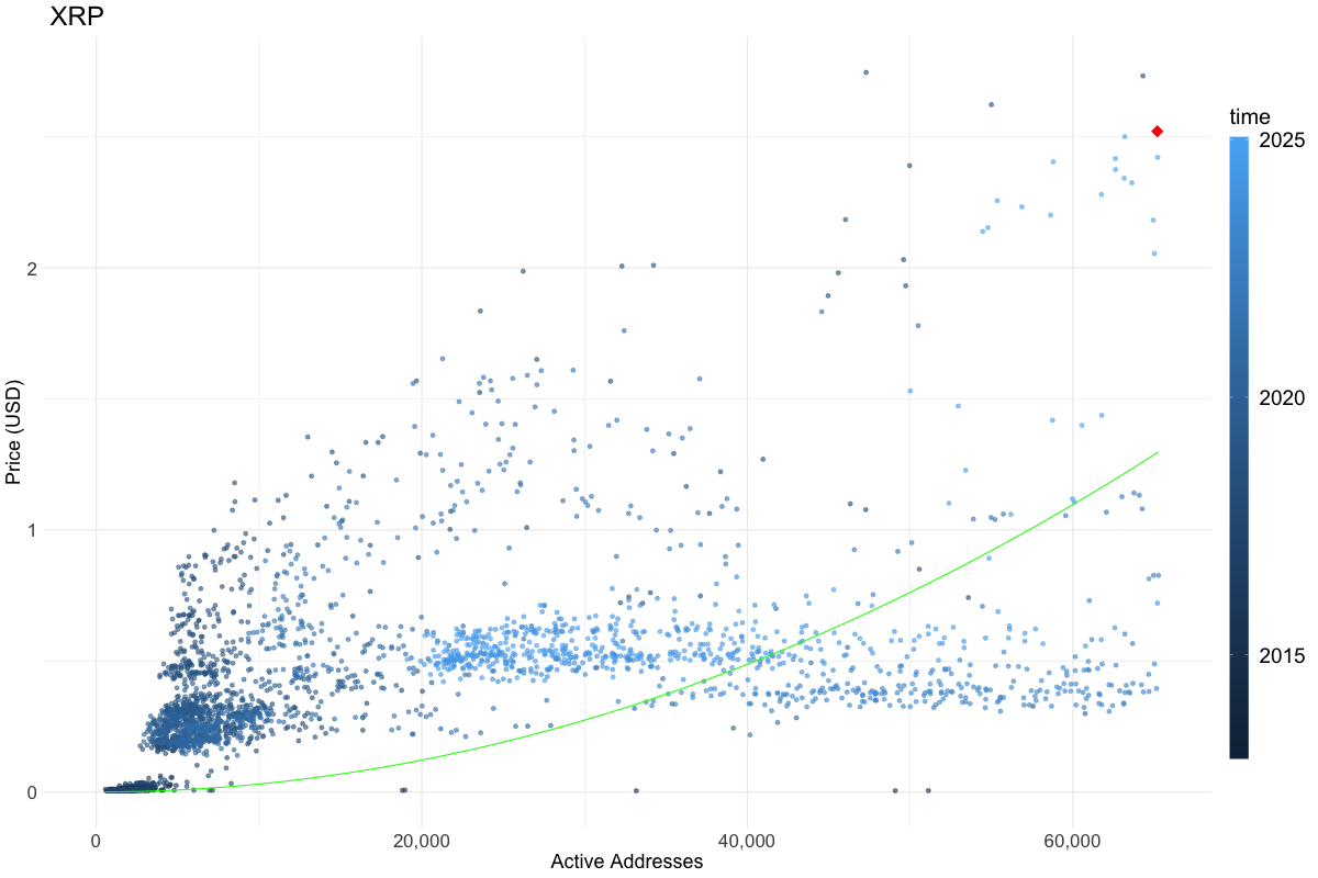
The correlation plot is a static representation with two key variables plotted: the number of active users on the horizontal axis (x-axis) and the asset price on the vertical axis (y-axis). The data points on the graph represent historical snapshots, showing how changes in the user base have influenced the asset's price over time.
Key Features
1. Function Fit Based on Metcalfe's Law: Aligning with Metcalfe's Law,
our plot employs a quadratic or a quadratic-logarithmic function to model the relationship
between the number of users and the asset's price, according to the asset's total supply.
This function fitting provides a theoretical curve that serves as a benchmark for analyzing real market data.
2. Valuation Analysis: The plot allows for an assessment of the asset's valuation
by comparing the actual market data points to the fitted theoretical curve.
This comparison categorizes the asset into one of three states: undervalued, overvalued,
or fairly valued, based on its deviation from the expected values.
3. Highlighting Recent Market Data: The most recent data point in the analysis is prominently
marked with a red diamond, providing a clear reference to the asset's current market position
relative to its historical performance.